Calligraphy service in London and stone cutting in Cambridge. Creative and beautiful calligraphy and Japanese calligraphy and stone cutting.

11/25/2012

We went to see ‘Calligraphy Today’ exhibition at Fitzwilliams Museum in Cambridge.
There are beautiful works by Herman and Gudrun Zapf, Frederick Marns. I loved the work by Hazel Dolby. Joan Pilsbury's italic book was a delight to see as always. But all and all, some of the works don't have the beauty in detail, struggle to see the author's intention. We happened to talk to a couple of visitors who doesn't have particular knowledge about calligraphy. They said they cannot see the point to make things difficult to read!
Why this is vertically lined.
Why this has all splashes all over.
Why this needs lots and lots of different, seems irrelevant styles each other.
Made us think a lot afterwards. I don't even like the front page of the catalogue. Individually they are beautiful. Just doesn't go together.

ケンブリッジで開催中の展覧会 ‘Calligraphy Today’ 見てきました。
ツアップ夫妻(特にグドルンさん)、フレデリック・マーンズのきれいなフロリッシュのカッパー、ジョアン・ピルスブリーのイタリック体の本など、見て美しいものもありました。私はヘイゼルの作品がとても彼女らしくて好きでした。しかし多くは、、題材に対しての考慮や意図、字体がよく分からないものが多くてがっかりでした。偶然に、見学の人と話す機会がありましたが、彼らはなぜわざと読みにくくするのか分からないと言っていました!全くその通り!!!なぜ、縦書きなのか、なぜしぶきがたくさん飛んでるのか、なぜ色んなたくさんの関係のなさそうな書体が入り交じっているのか、、、考えさせられました。
写真はカタログの表紙です。それぞれに素敵な字であるのに、間違った組み合わせ方だと思いませんか、、、。

11/01/2012

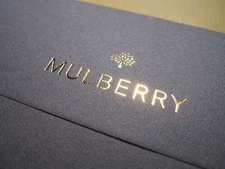
Mulberry invitations


There were not that many but lovely thick card to write on. They always know the quality! I love their products but also their logo, too. Very simple yet stylish :)


10/27/2012

New Bond film Skyfall is on! 

I was asked to produce a piece of art work from product designer back in Dec 2011. I was no special 007 film fan but was still excited. Art Department and Set Decoration section looked really cool with very creative, exciting ideas and designs!

It was for the Chinese bed room scene. He knew what he wants for the piece so it was not so hard for me to come up with some ideas. The character he wanted means ‘long happy life’. I added the popular poem on the sides. 

Hardest was the size. It was 1m square. I bought papers to try in London and also Kyoto, Japan. In the end what he loved was the best paper from shop in Kyoto. It was white, thick and very high quality. Took a week to finish. And I'm happy with the result.

007の最新作であり23作目の スカイフォール公開!

2011年の12月に、中国(マカオ?)スタイルの寝室にかかる作品を作って欲しい、と依頼がありました。会って話を聞いたり、資料を見せてもらったりするために、パインウッド撮影所まで行きましたが、アート部門、セットデコレーションの部門には色んな資料があって、とてもエキサイティングでした。デザイナーの方は既に、私に書いて欲しい字を決めておられたので、それに基づいて4〜5アイデアを出し、各々の書体について説明した後に、デザインが決定。

何せ、1m四方と大きいので、ロンドンと日本へ帰国した際に紙をいろいろ買ってみて試しました。少しは紙に厚みもないといけない。結局、京都、寺町の紙司柿本さんという紙屋さんで買った高価な紙に決定。白くて、十分厚くて大きい。筆を置いた時に、すっと墨をいい感じで吸ってくれる感触が、ロンドンで買った紙と違いました。下書き、練習、レイアウトから清書まで1週間少し。映画を見に行って、見つけるのが楽しみです。

10/17/2012


St John's Bible の話を、Donald Jackson が Letter Exchange で話したのを聞いてきました。普段なかなかいっぱいにならない聴講席が補助椅子も出ても座りきれないほど大盛況で、私は階段の上でした。

http://www.letterexchange.org/about-us/events/lx-lecture-donald-jackson-lettering-artist.html

どういう風にプロジェクトと関わったか、というのがメインテーマでした。
全体として何度も言っていたのが、context という単語。文脈、という風にも取れますが、おそらく文章との関わり方、という意味で言ってた気がします。あなたも、私も、この世界全体が何らかの形での関わり方である。自分の「肌の下」に入ってくるくらい、感じること。

また他に印象に残ったのは、完璧でなくて良い、ということでした。その時の勢いとか、ノリとかが、出ちゃうんだ、でもそれでいいんだ、という風に。

それを聞いて思い出したのは、先日読んだ、石彫りの Tom Perkins が、Jack Trowbridge にインタビューしていた記事にも似たような言葉がありました。石に彫る前に下書きをするのを、正確すぎない方が良い、ということを師の David Kindersley と、John Skelton が異口同音で似た意味の事を言ってたらしいです。

自分の「肌の下」にまで入ってくるまで感じられるくらい、仕事の受けてからの時間があるのか、そういう仕事が来るのかなあということと、ぎちぎちに書かないで、自分の勢いをふっと出した時にそれが良いものであれば、出してもいいんだろうなあと思いました。

I was at Queen's Square to hear Donald Jackson talked about St John's Bible project. It was packed with calligraphers all over UK.
Main point was how he connected to this project. Often he used the word ‘context’ which I think he meant how he (we) connected to the subjects. You're a part of it, they are also a part of it, he said. Feel it under your skin.

Another thing he said was it doesn't need to be perfect or precise. Sometimes you can see or feel the scribe's tension, his playfulness, and that's fine. Isn't that the whole point of making something by hands?

That reminds me that I read the interview article between Tom Perkins and Jack Trowbridge (in Forum 24) and they said their masters David Kindersley or John Skelton said the similar thing - they wouldn't want to have it too precise.

I wish I could have enough time to subject sinking into under my skin, wish to take such kind of commissions, and also, I have to be confident enough to let myself go. Maybe I'll have another thoughts later, but tonight.

10/12/2012

I was at St Bride's Library to help setting up SLLA exhibition this afternoon. With a bit of struggle to nail things, making everything straight, it looks lovely in the end.

セントブライズにて、SLLA の作品展の搬入のお手伝いをしてきました。良い意味でバラエティに富む内容です。四角のものをまっすぐに設置するのは難しい、、、。


Afterwards, when I putting tools and bubble wraps into the cupboard next to the room, I just noticed the shelves I was putting things are actually filled with letter press printing fonts,,, Of course we are in St Bride's. No surprise there.


片付けをし、期間中に置いておくものを、隣接の物置小部屋に移していた時に、ふと気が付きました。棚がほぼ全部、活版印刷の活字でいっぱい、、、。セントブライズですから。

Some says Baskerville Greek. Some says Sanskrit. aw...  

思いがけずに宝物庫に入った気分でした。

10/10/2012

Also coming up is SSI AGM. 
http://www.calligraphyonline.org/Pages/agm.html

I'm looking forward to attend the lecture, meeting people but also to hear the good news of newly elected Fellow.... Can't wait.

SSI の定例ミィーティングが、来る13日(土)にあります。レクチャーも楽しみですが、新しくフェローになる選考会があり、良いニュースが待ちきれません。